
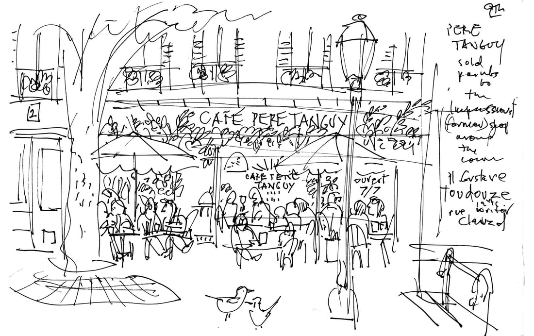
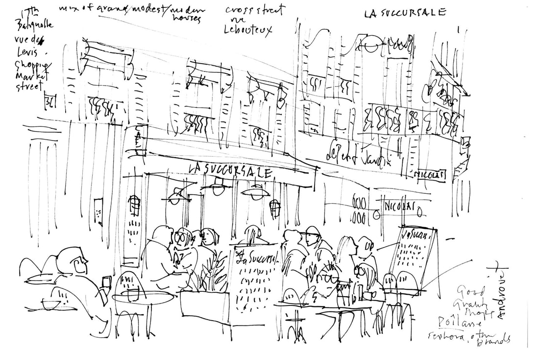
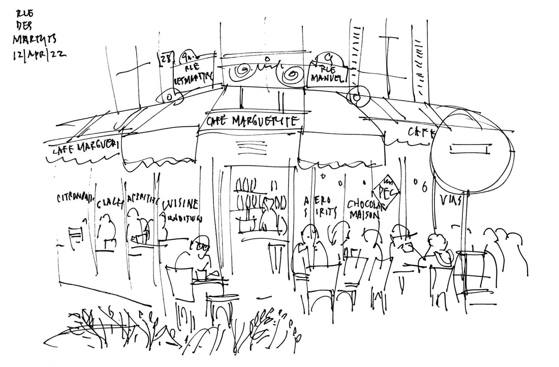
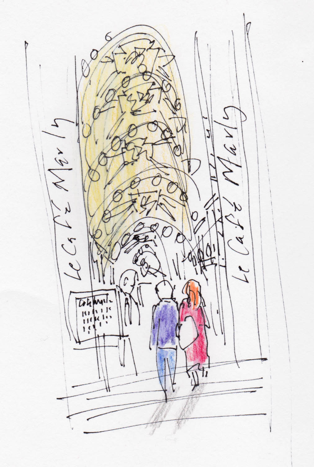
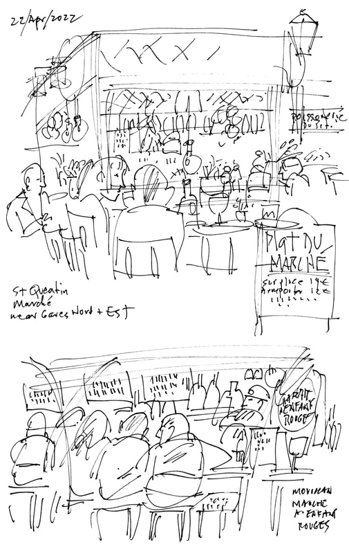
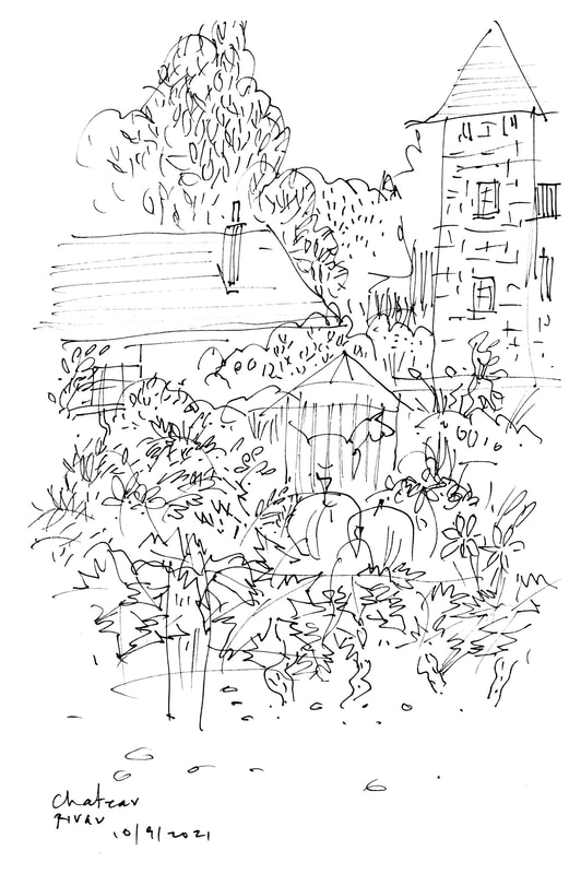
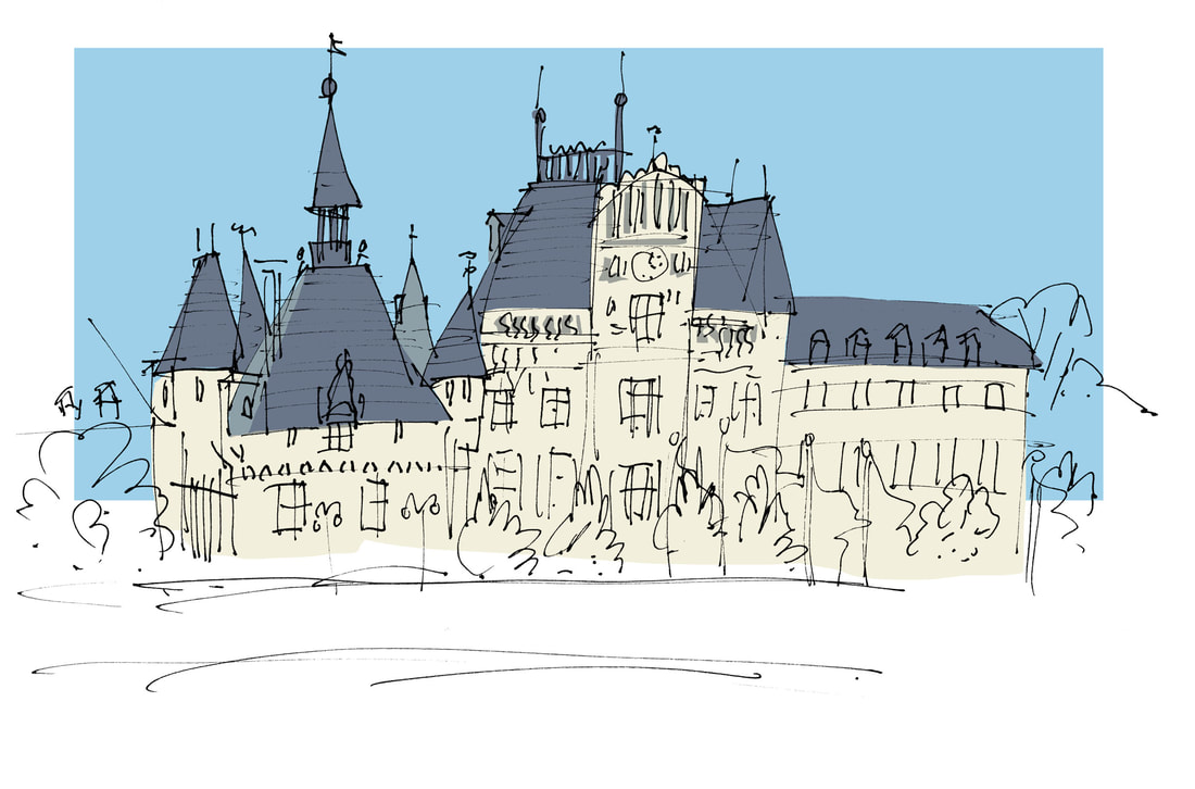
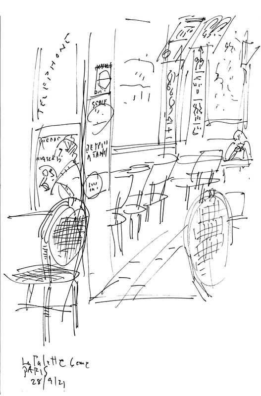
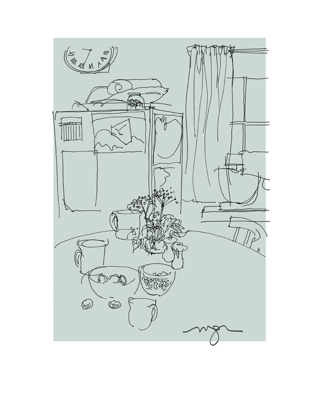
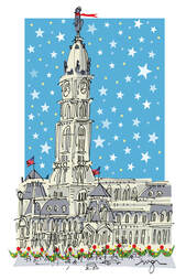
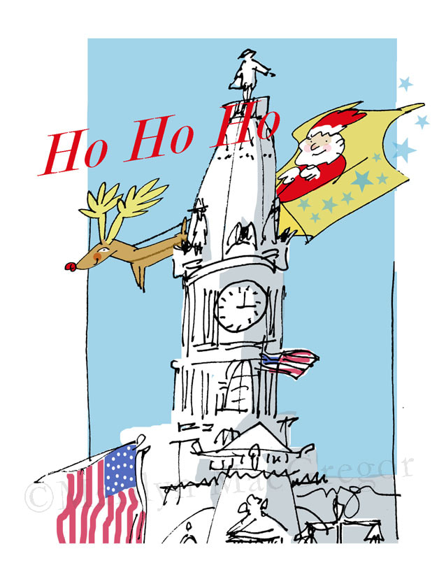
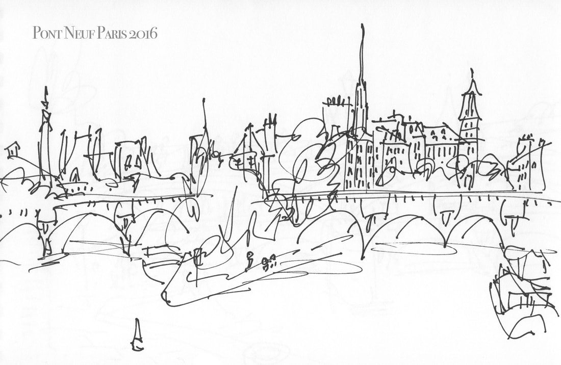
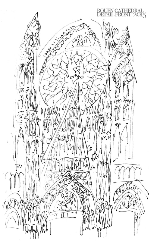
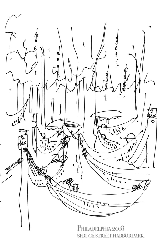
I wasn't very good about blog posts during the last couple of months - apologies. It was a busy time in France with a big solo show and .... well, a lot of nice people and fun things to do. But now that I'm back in my studio for a while, my thoughts are with the series of Still Life drawing/paintings I started before I left.
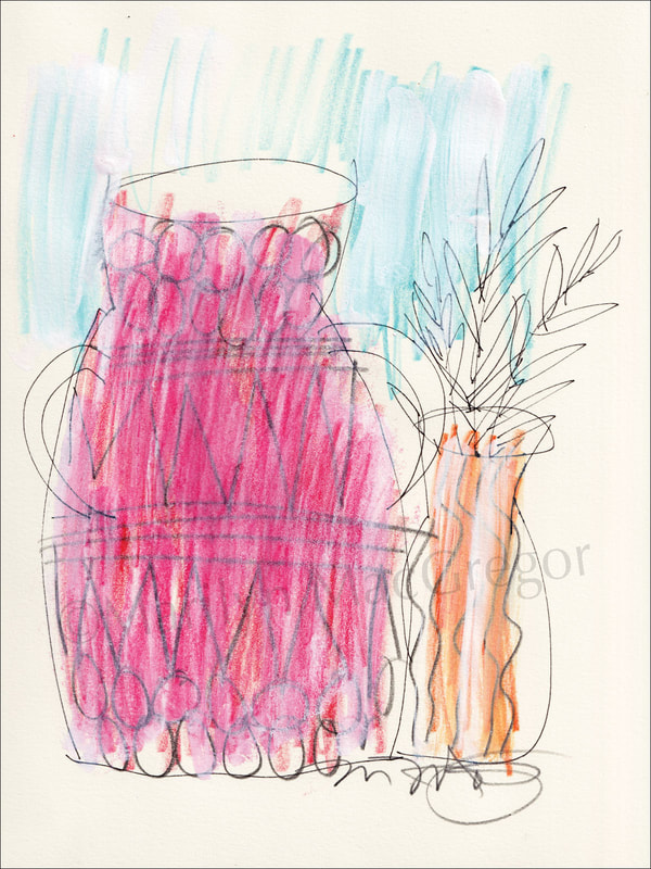 | 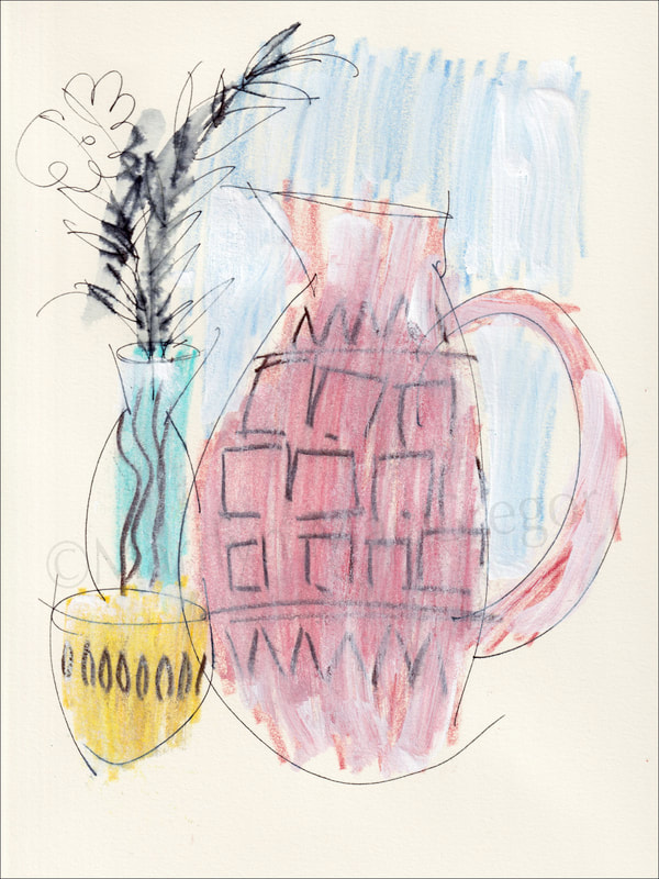 |
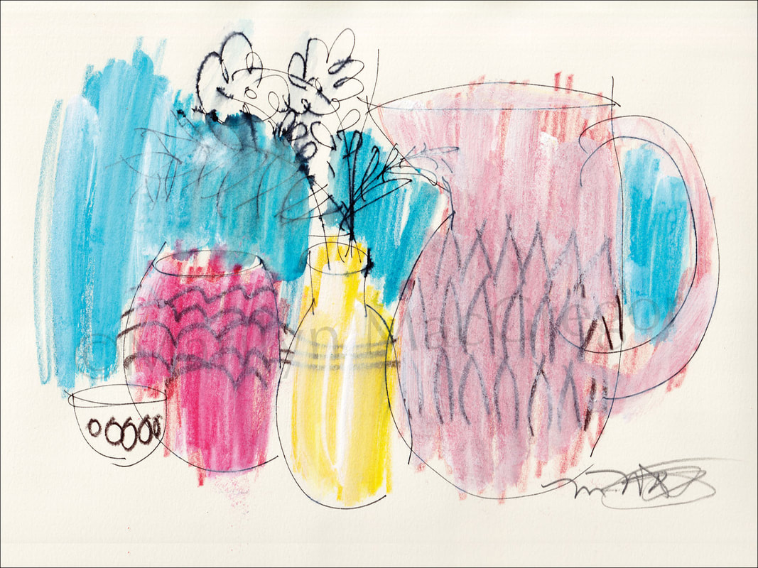
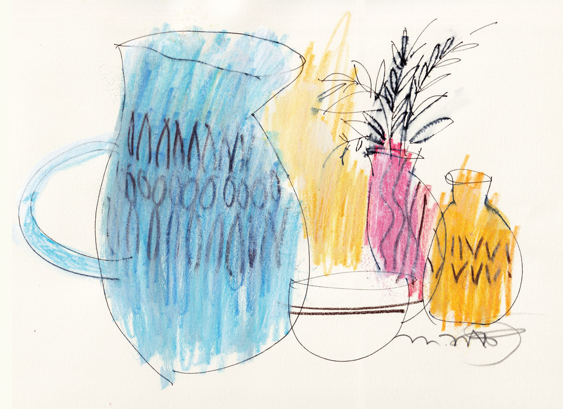
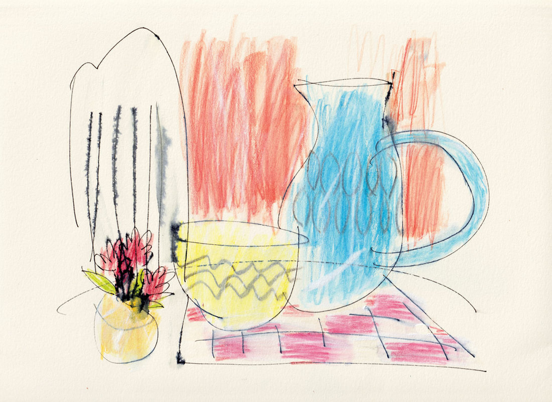
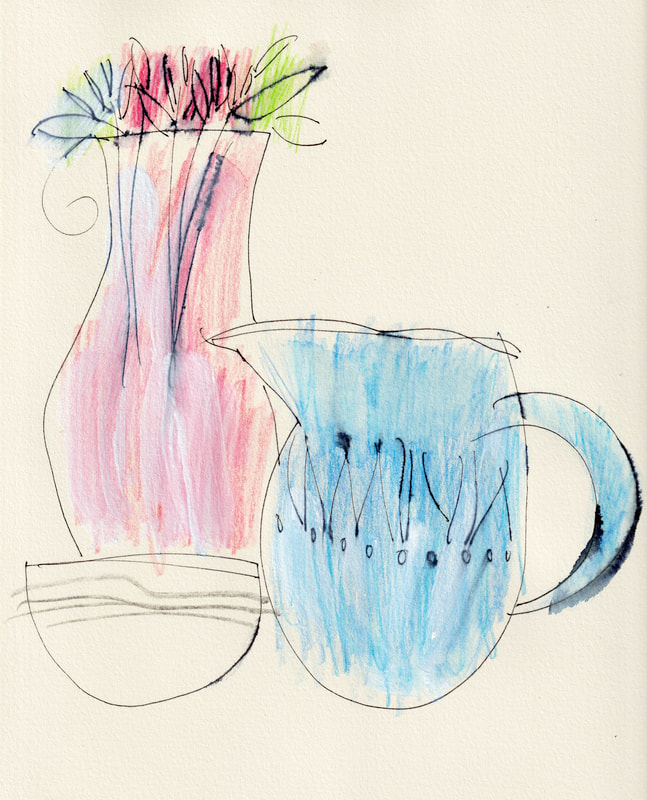
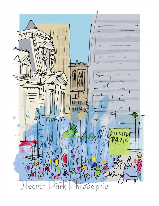
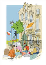
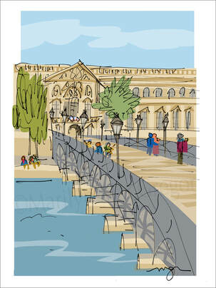
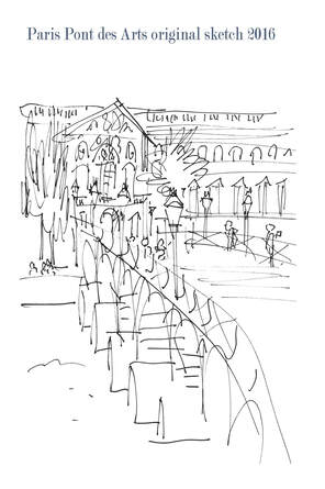
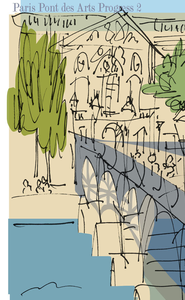
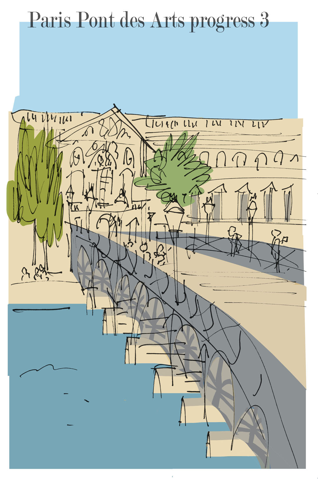
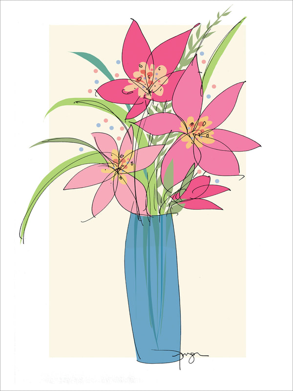
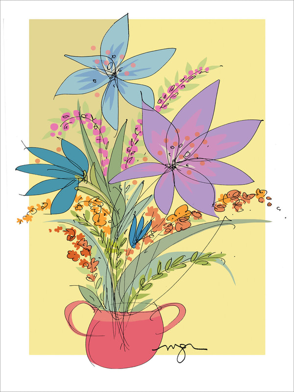
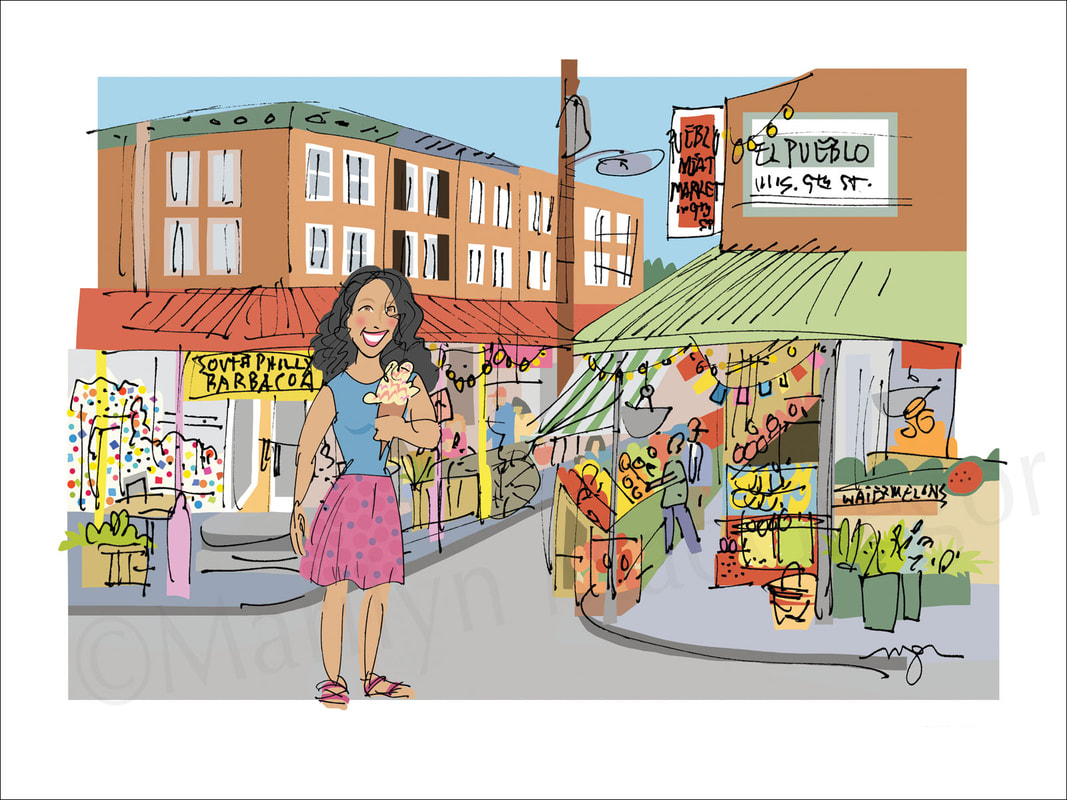
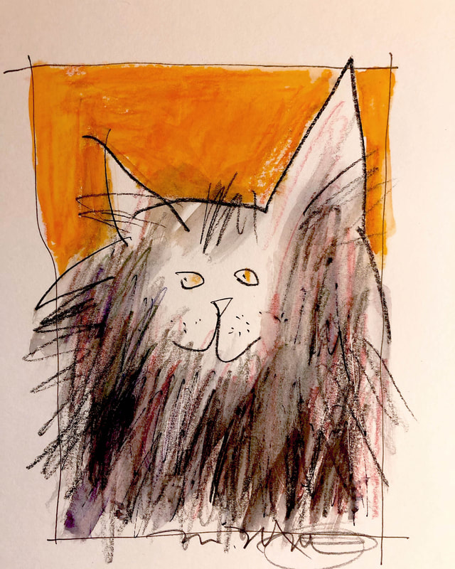
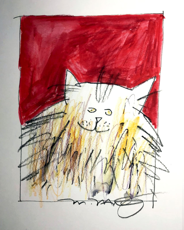
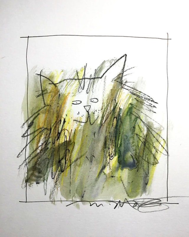
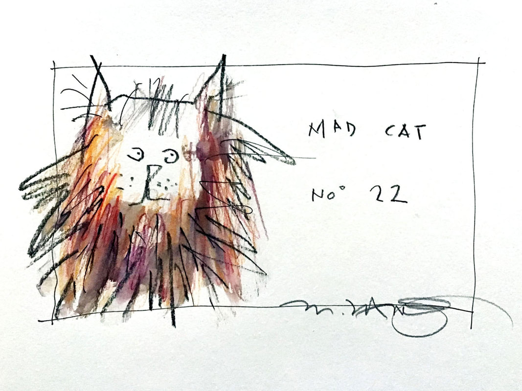
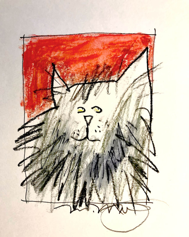
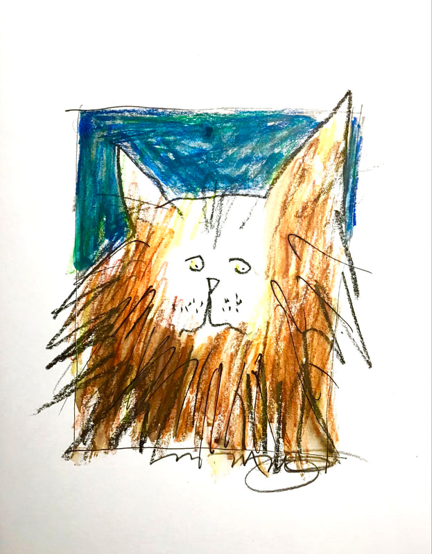
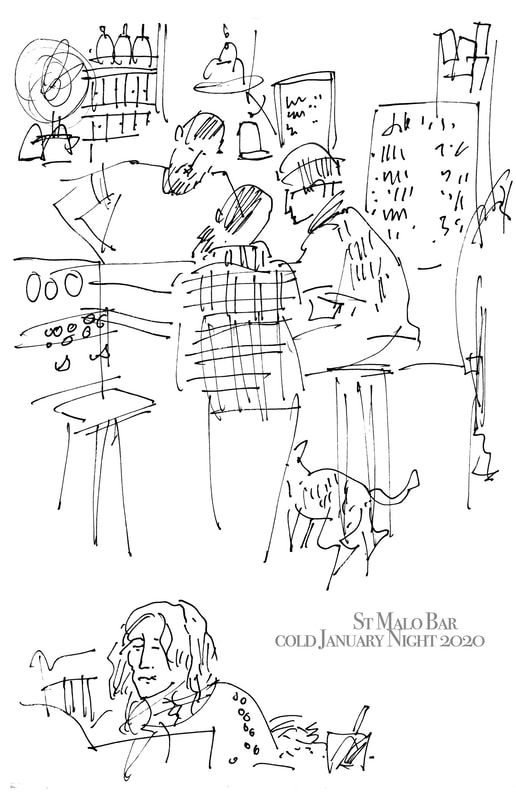
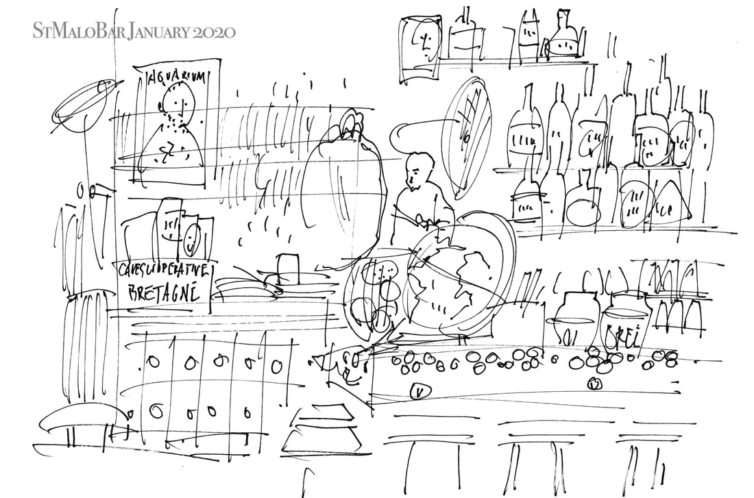
Like my better known scenes of Philadelphia and elsewhere, these start with line drawing - free, spontaneous, loose. But they then continue with a mix of media - watercolor pencils, charcoal, pencil, gouache and acrylic. I always like my original works on paper best when they are a conversation, an exchange between me and the materials. Here I'm letting the lines and colors have free rein to gallop on the page, guiding and nudging, happy to follow as much as to lead. This series, called Pots, Bottles, and Jars, is on-going.
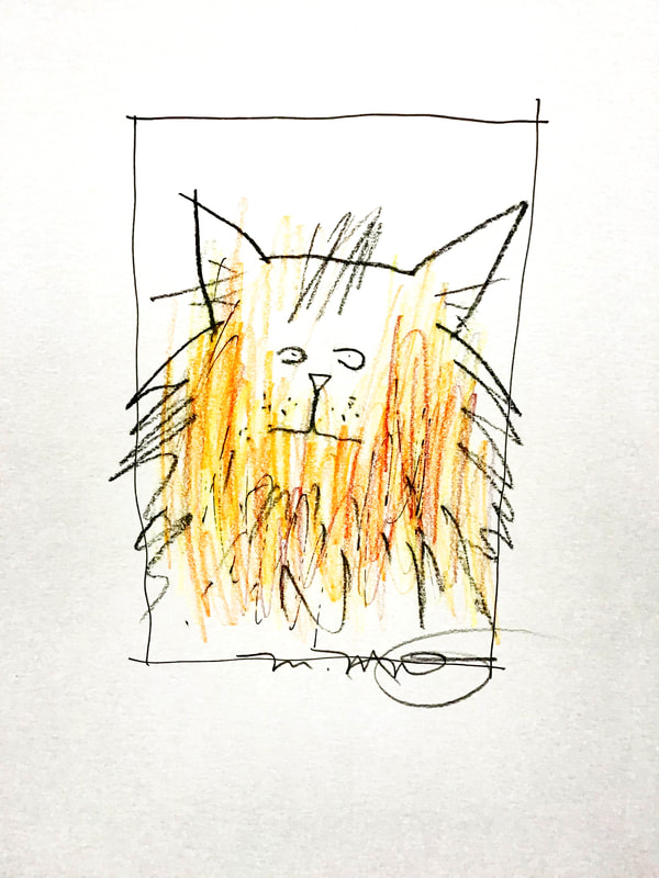
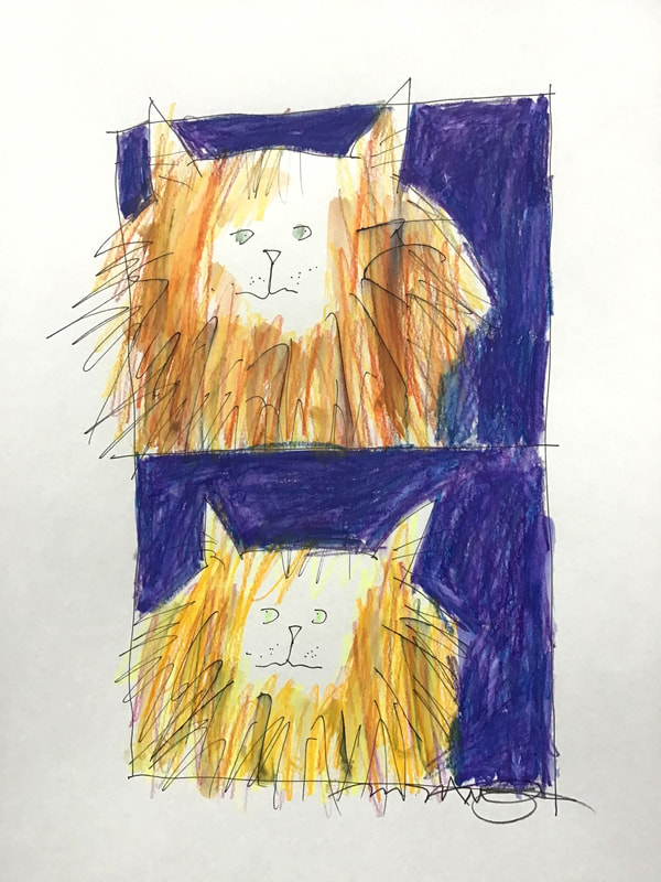
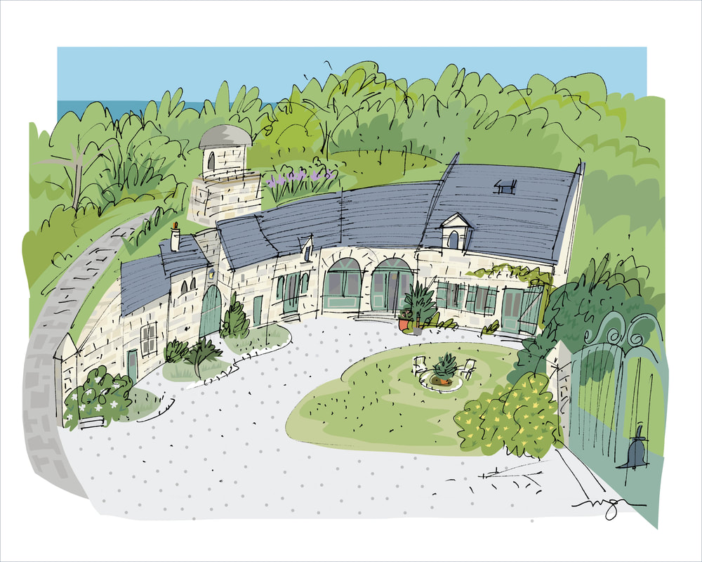
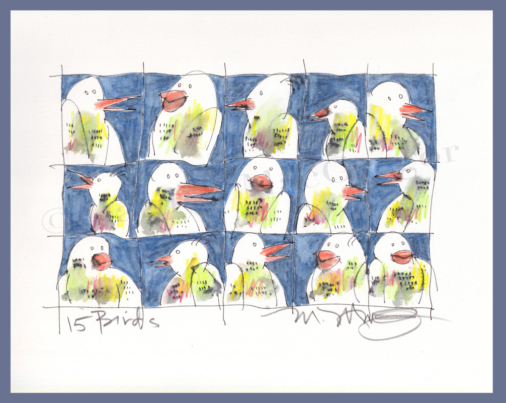
I've set up a new website to show the range of my work, including Pots, Bottles, and Jars (my Still Life series), my Philadelphia and International scenes, series of Creatures, abstract works. I'm also working on revising and adding sites to make these available for purchase as originals and/or prints. Stay tuned, and please take a look at the new site www.mmacgregorart.com
 RSS Feed