Comments are welcomed - let me hear what you think!
|
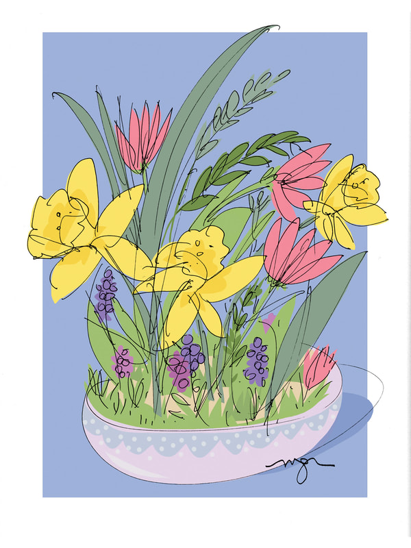
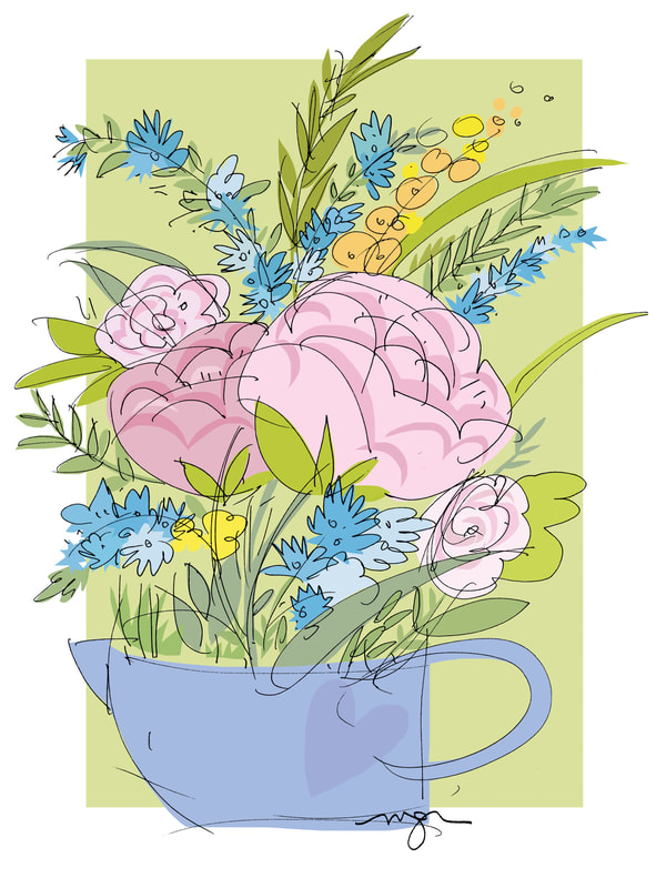
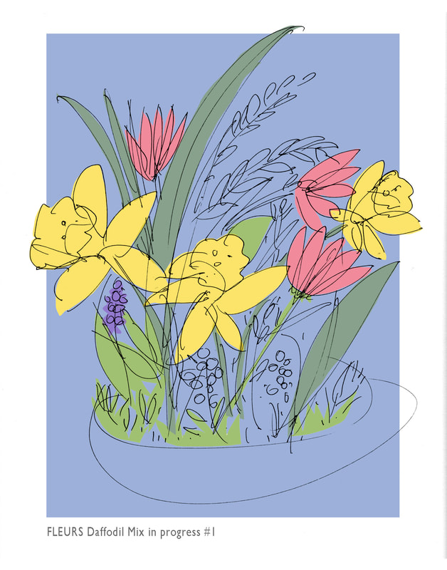
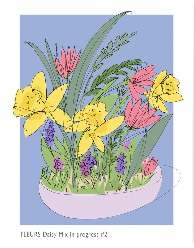
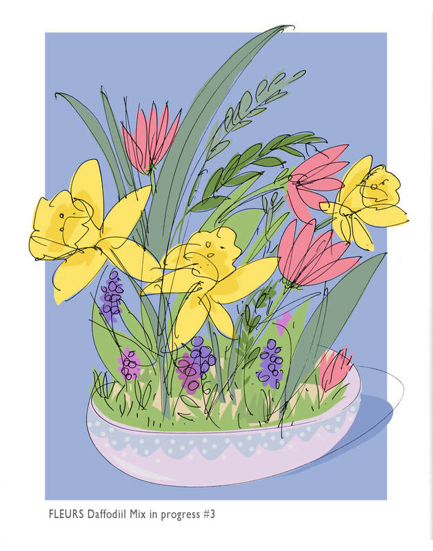
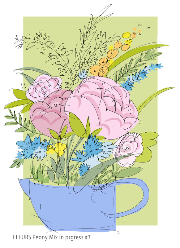
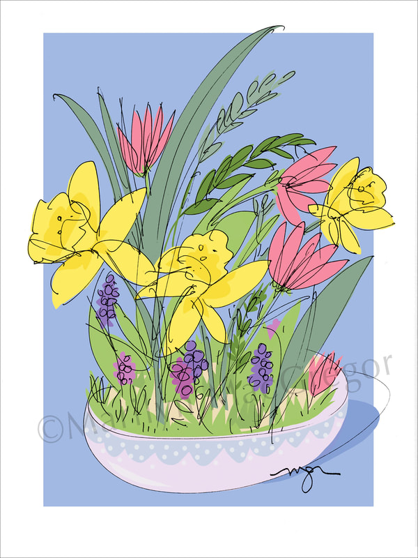
My ongoing series of FLEURS is getting some new additions. These designs are a delight to create, so I wanted to share some thoughts about them and the steps to finished works. My intention is always 2-sided: having the pleasure of free drawing fresh organic lines and shapes, and making colorful, cheerful images that people - you - will enjoy as prints and cards. These are the first two of six recent FLEURS line drawings. I always think of drawing as a dance, and never is this more true than with florals. I pull ideas from some kind of reference - living flowers or photos - but add freely from memory and imagination. As here, I like my arrangements to have a base - a pitcher, a vase, a bowl, maybe just a ribbon tie - to bring the exuberance of the flowers to a gentle conclusion. After I scan the original drawings into my laptop I have free rein to digitally paint them into full color. My painting process, though digital, is as freehand and intuitive as with any other painting medium. I have a wide-ranging palette, with a concentration of favorites. The digital process allows me a truly unlimited world of tints, shades, overlays, and harmonies - all while letting me keep the clean integrity of the drawn line. As you can see, I approached these two drawings slightly differently: on the left I used the yellows of the daffodils as the anchor, while the right has the anchor note in the blue of the pitcher. The background color always comes first, but sometimes as I fill in the color I change that - again, with the digital process I can try out all kinds of variations without having to disturb what is in place and working well. For the final stages I focus on harmony and contrast, making sure that every detail contributes to the balance and tenor of the composition. The little grape hyacinths in the lower third counterbalance the more assertive forms of the daffodils in the central band, and the slightly fussy decoration of the bowl adds some low key charm supporting the grassy greens at the rim. For this I chose a closely related palette of bright aqua blues for the small climbing flowers to accent the dominant round forms of the peonies, with a few yellows and light oranges as middle notes. I follow my lines closely but not over exactly, prizing the loose sense of freedom that make the final design alive (but spend a good amount of invisible time at the end cleaning up any sloppy loose ends) People often comment that the loose nature of my work, as well as the colors, is what brings them so much pleasure. Look for these new designs for purchase as cards and prints on my website and watch for the rest of the new FLEURS coming soon. Also watch for those original freehand drawings to be finished with watercolor, pencil, and gouache - that flexibility is another advantage of the digital process.
Comments are welcomed - let me hear what you think!
0 Comments
Leave a Reply. |
Marilyn MacGregor
Artist/Designer/Illustrator - Drawing is my way to see and think about life in all its dimensions, color, meanings, and pleasures Archives
July 2023
Categories |
 RSS Feed